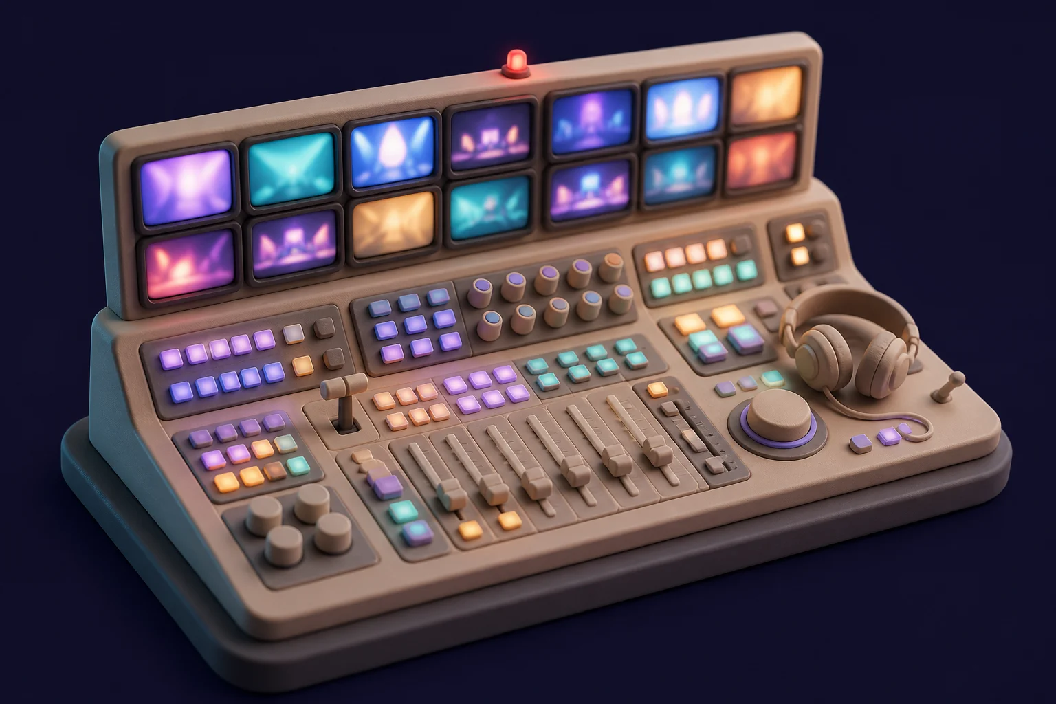
There is a moment in every live broadcast when something goes wrong. A source drops. A graphic misfires. A remote feed starts stuttering thirty seconds before air. What happens next depends almost entirely on one thing: whether the people in the control room can see the state of their world at a glance and act on it without thinking.
That environment shaped how I design software more than any course or design system ever did.
Interfaces where failure is not an option
A broadcast gallery is a wall of state. Dozens of monitors, tally lights, audio meters, countdown clocks. Nothing on that wall is decorative — every pixel answers a question someone will ask in the next ninety seconds. When I started building SaaS dashboards, I carried that discipline with me:
- Every element must answer a real question. If nobody would miss it during an incident, it does not belong on the screen.
- State must be visible, not discoverable. A control room never hides the master fader behind a settings menu. Your app should not hide sync status behind three clicks.
- Red means red. Alarm colors are sacred. The moment you use red for a marketing badge, you have taught your users to ignore emergencies.
Glanceability beats density
People assume control rooms are cluttered. They are actually ruthlessly economical: high-contrast type, consistent positions, information that stays where you left it. Operators build muscle memory — the same way your users do with a dashboard they open every morning.
The lesson for product design is that layout stability is a feature. Moving a button in a redesign has a real cost, paid in operator hesitation. In live TV that hesitation is measured in dead air. In your product it is measured in churn.
Calm software
The best broadcast engineers I met shared a personality trait: they were calm, because their systems were calm. Alerts meant something. Automation was predictable. Fallbacks were rehearsed.
That is the quality I now chase in every product I build — what I call calm software:
- Predictable latency. A spinner that always takes two seconds beats one that randomly takes ten.
- Rehearsed failure. Error states are designed first, not last.
- Honest progress. Never fake a progress bar. Operators always find out.
The operator mindset
When I design a SaaS dashboard today, I do not picture "a user persona exploring features." I picture an operator, slightly tired, mid-task, with something else demanding their attention. If the interface serves that person, it serves everyone.
Broadcast taught me that reliability is not an engineering property bolted onto a design. It is the design. Everything else is set dressing.